Alright dudes, per usual, things in here are not *totally* complete, but we can just look past the missing trim for now. I wanted to share my little office reveal and some more details on this easy DIY wall pattern, so let’s get to it:
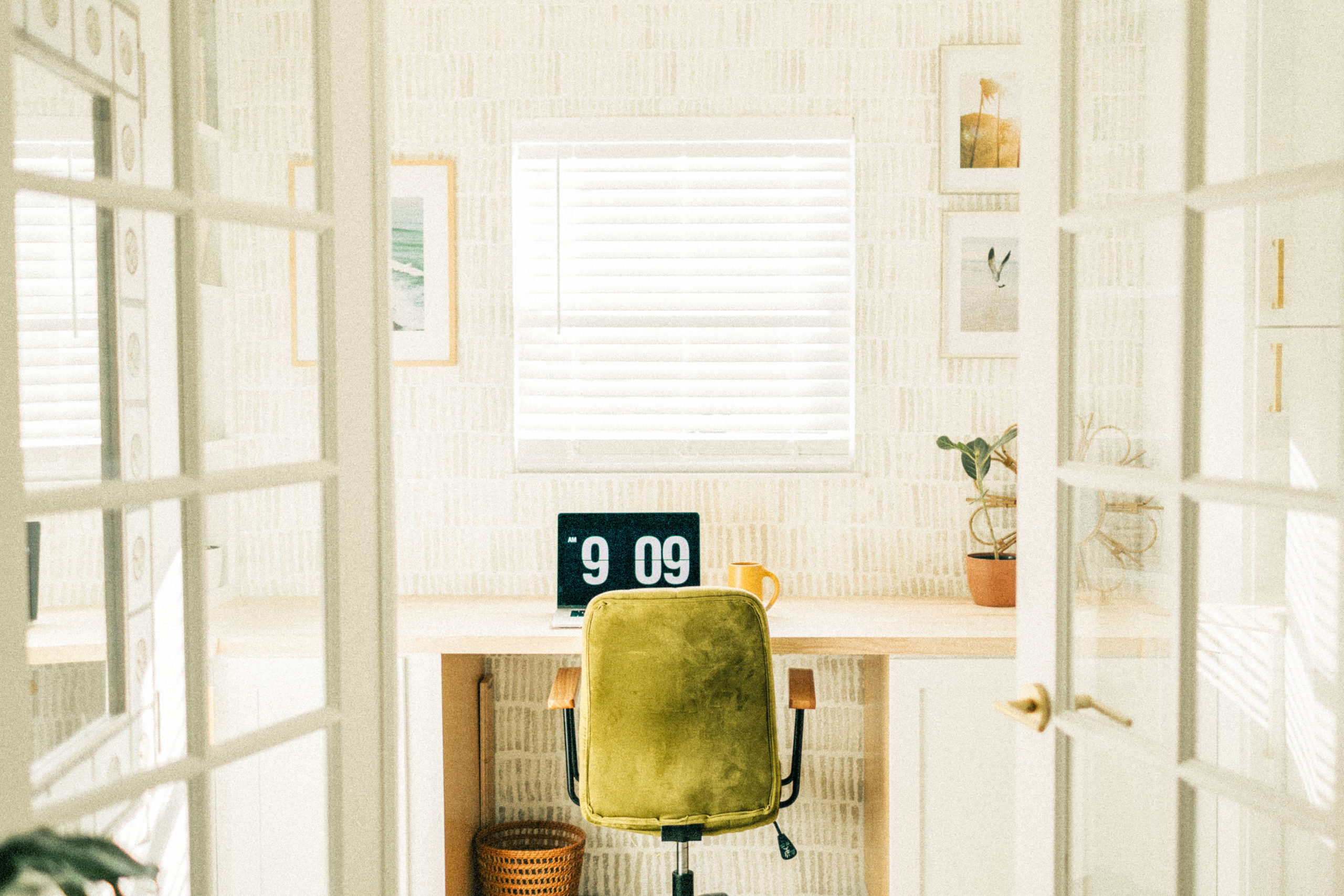
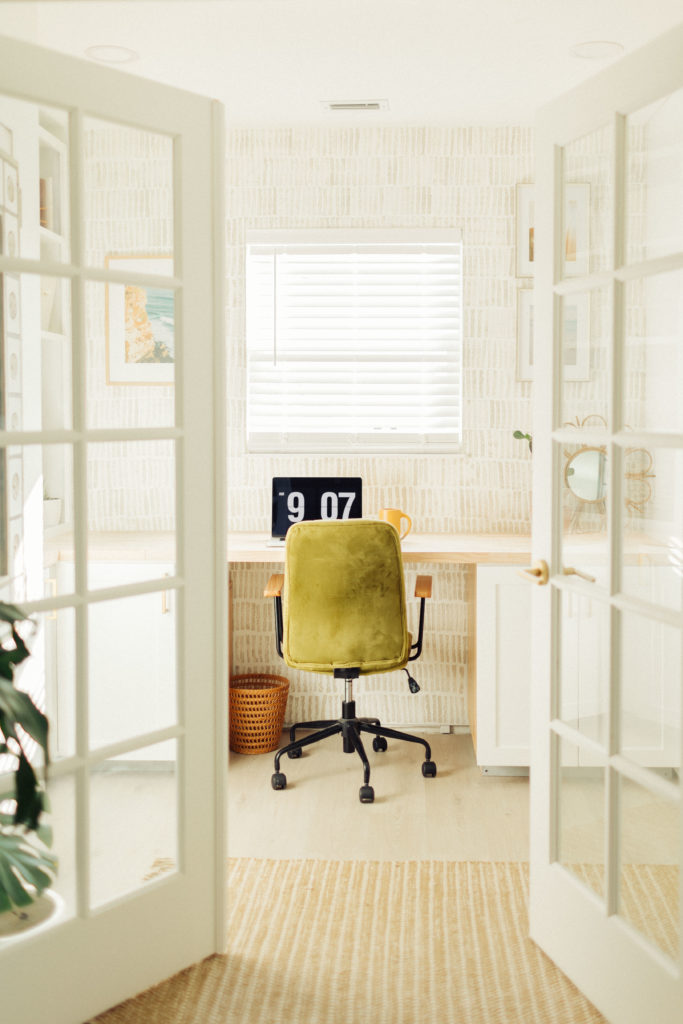
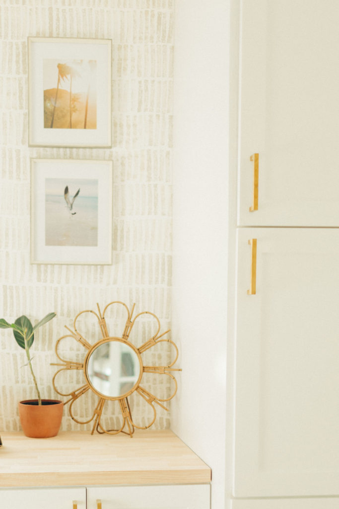
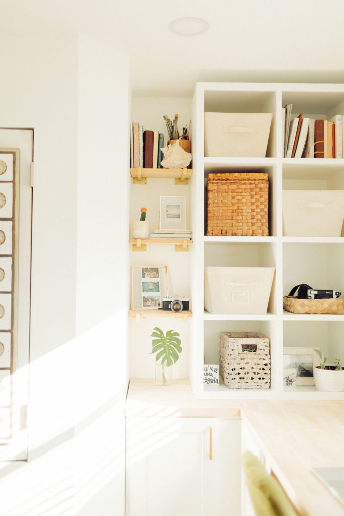
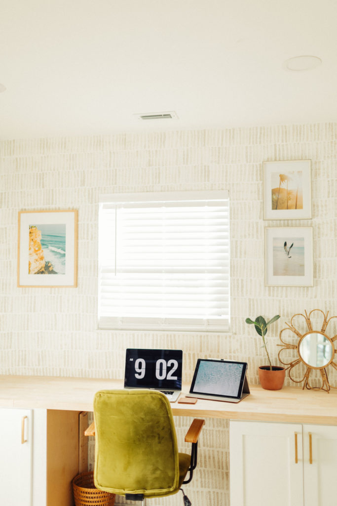
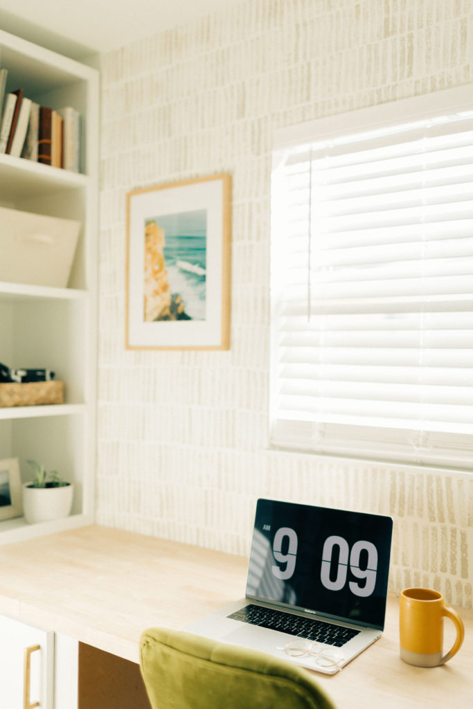
After removing the walls between our kitchen/ living/ dining rooms, we were left with a bright, open floor plan, but an awkwardly long living space. So, we decided to frame out this area on the back-side of our living room to create my office and use up the dead space. My two favorite touches in here are the french doors to let the light pass through, & the cube shelf my dad & I built for my college dorm (where I officially launched this business–yay for a full circle moment!). We re-finished old cabinets to match the adjacent kitchen for a more cohesive feel. Butcher block countertop from Home Depot, floating shelf brackets from Amazon , cabinet pulls leftover from our Kitchen reno, frames & office chair from Homegoods, & photos from my Print Shop make this space extra happy.
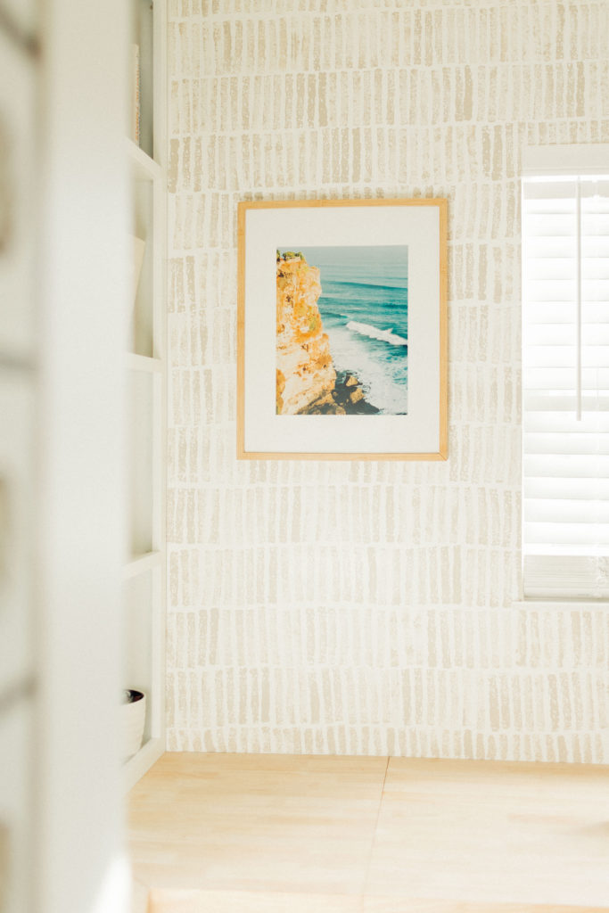
And what you’re probably here for: the wall pattern. Truly the easiest DIY–I spent $4 and one hour to create this faux wallpaper vibe and I’m stoked on it. I saw this idea on Pinterest from @via-justine. It added the perfect amount of funk to my all-white office. I posted a reel on instagram and received a few messages asking for more deets. So here’s the breakdown if you want to do this in your home:
- Pick up a kitchen sponge (like the cheap, simple, foam ones) & a tiny paint sample from the hardware store. I used the color ‘Sculptors Clay’, just like Justine in her original DIY. For this wall, I did’t even go through half of my paint sample.
- Use scissors to trim the edges of your sponge to give it a more rounded edge.
- Pour a bit of paint on a paper plate or paint tray to gently dip the long edge of your sponge into. I also used a paper towel to dab off extra paint before going onto the wall.
- Sponge in a row and repeat until you’re done! I re-dipped after every 6th stamp or so. This was so dang easy. I was considering mapping things out with a level to create a straight outline, but I decided to just go for it. The imperfect pattern is what I love most about it. Give it a shot and if you hate it, just paint over it! (But you won’t hate it).

LEAVE A COMMENT
Comments